Window Lit Zoë Kravitz Oct 2017
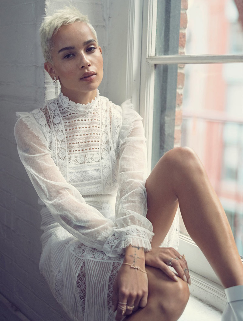
This Stas Komarovski photograph of Zoë Kravitz for Edit Magazine is a picture I’ve tried (and failed) to take many times.

Why I Love This Picture
Zoë Kravitz is having a bit of a moment, she is in every photo shoot. I liked her October 2017 British Vogue cover, but I love this one. People sometimes talk about classic beauty, but Zoë has a really modern face. She looks beautiful, fresh faced, elegant and totally in control in this picture.
The white tones tie the photograph together. Using lots of white can make a picture look clinical. What makes this image work are all the different tones and textures of white: the darker bricks, the grubby window frame, the highlights on Zoë’s dark skin, the sheer fabric against her arms and the differing textures in her hair and shoes. The tones and textures add layers to the image, making it feel much warmer than it should.
The styling and makeup are perfect. They’ve done a light-touch makeup look, keeping Zoë’s skin fresh and glowy and showing off her freckles. She looks so young and healthy. Although the clothes are all quite elaborate (the dress in this cover shot is my favourite), keeping everything white tricks us in to thinking the styling is simple. This makes the picture look effortless. It’s like she just turned up to the location ready to go.
Soft window light is the best lighting. Side on you get the bright highlights on her prominent facial features, but then diffused and even lighting filling in the rest. It’s often framed like this with a model sat on the window sill. It can be really difficult to get a natural looking pose, you’ve got very little space to work with and you can’t always get two legs into the shot elegantly. You need to avoid squshing arms, legs and body against each other. It looks like a really natural pose in this shot, but I imagine it probably looked quite awkward in real life, it likely took a lot of experimentation to get there.
Stas Komarovski has not tried to over-perfect this image and it’s all the better for it. There’s a tiny bit of Zoë’s left ear visible above and below her cheek, her earring flows into her dress and her right hand is a little ungainly. It can be the little imperfections that make an image. Post production have done a beautiful edit. As with the makeup, it’s had a really light touch, skilfully applied — they’ve even kept the tiny little bruises on her legs. It might seem like an omission but this will have been a deliberate decision.
This photo had me at short hair and freckles. I loved it because of the window light, the multiple layers of tone and texture and the perfect little tilt of Zoë’s head.
*Photography Nerd Notes
A photo like this is all about balancing the light outside against that inside (without any additional lighting it will always be brighter outside).
One option is to light the inside with a flash, matching it to that outside. This will provide a well lit image for both the model and the street. It might sometimes be used in a portrait, but it can look a little flat. This is my least favourite way to light a window setup.
A second option is to meter for the inside. This will blow out the background (the window will be all white), it’ll also wrap around the sides of the model. This can look really cool — you’ll lose detail in the face and get nothing from outside, but it can look very dramatic, almost angelic. It’s how Michelangelo would paint his angels.
The third (and my favourite) option, used in this picture, is to go somewhere in the middle. They’ve used a white reflector in front of Zoë. This will bounce some light from the window back on to her face, brightening it up, making it closer to, but still not as bright as the outside. It’s a flattering way to light a face, especially if the model has great skin. You lose some detail from the outside as it’s still a little too bright, but not as much as with option two. The lack of detail outside gives you a sense of what’s going on in the street, but keeps the focus on the subject.

